— 01 / Templates —
Resume Templates
Find the perfect resume layout for your next job. Preview, customize, and download in seconds.
Recruiter Templates
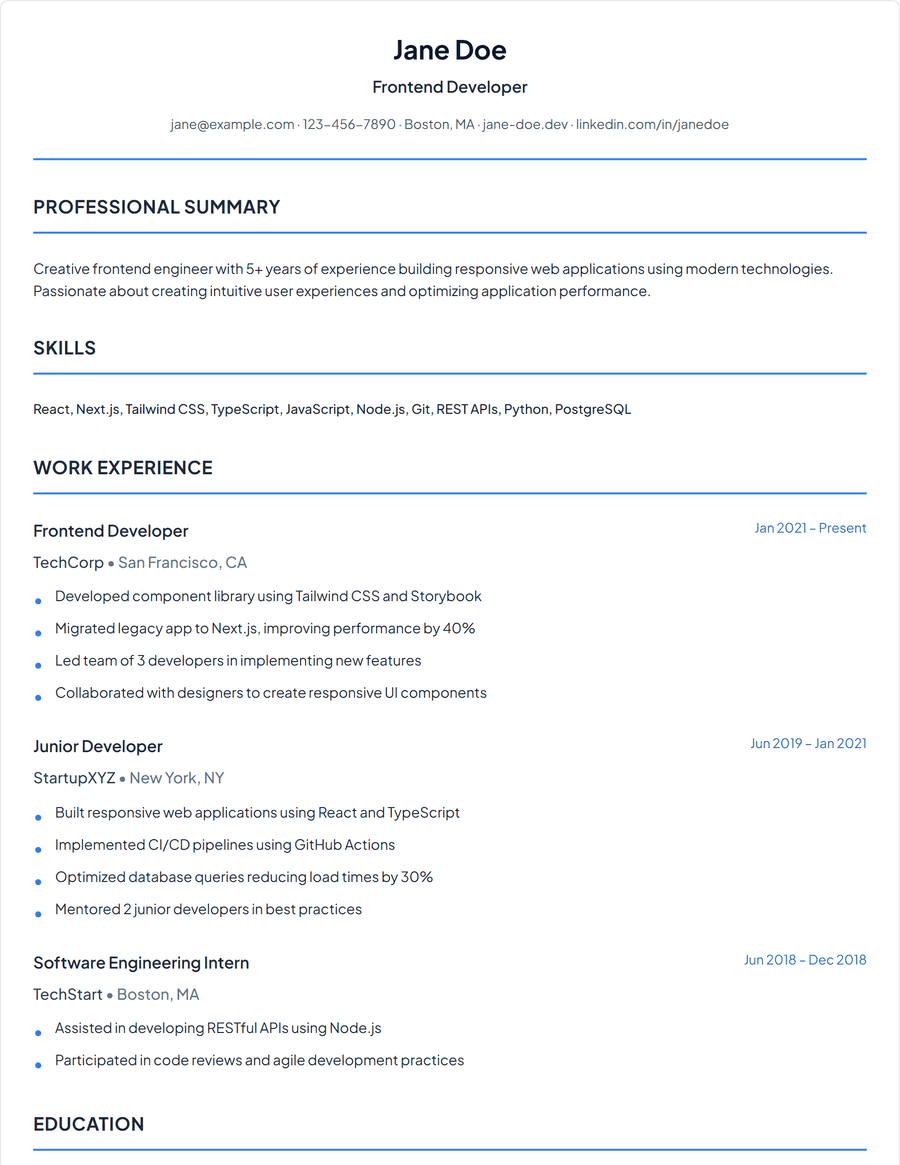
Classic
Traditional one-column layout
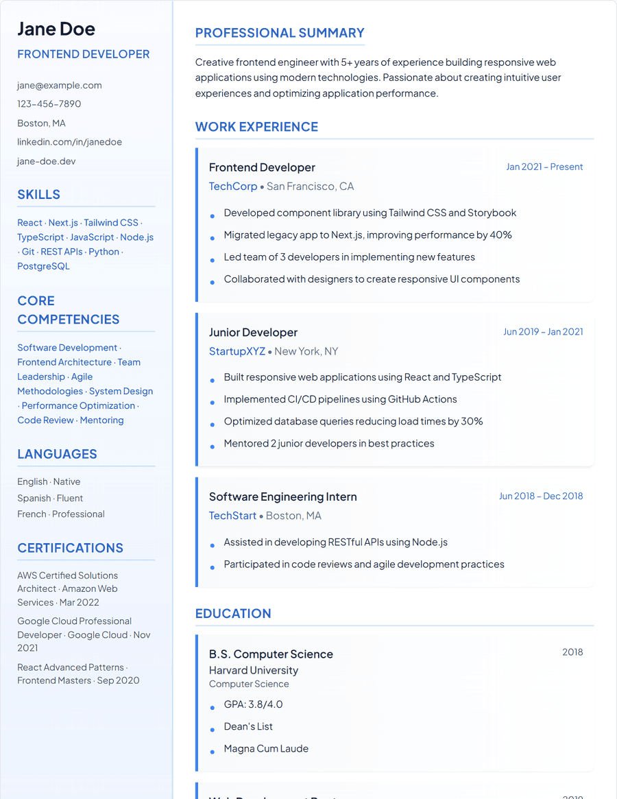
Modern
Two-column layout with sidebar
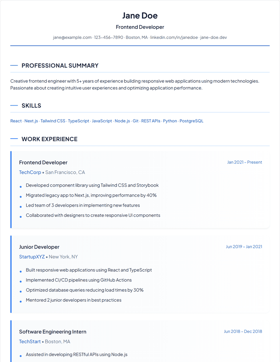
Elegant
Professional layout with refined styling
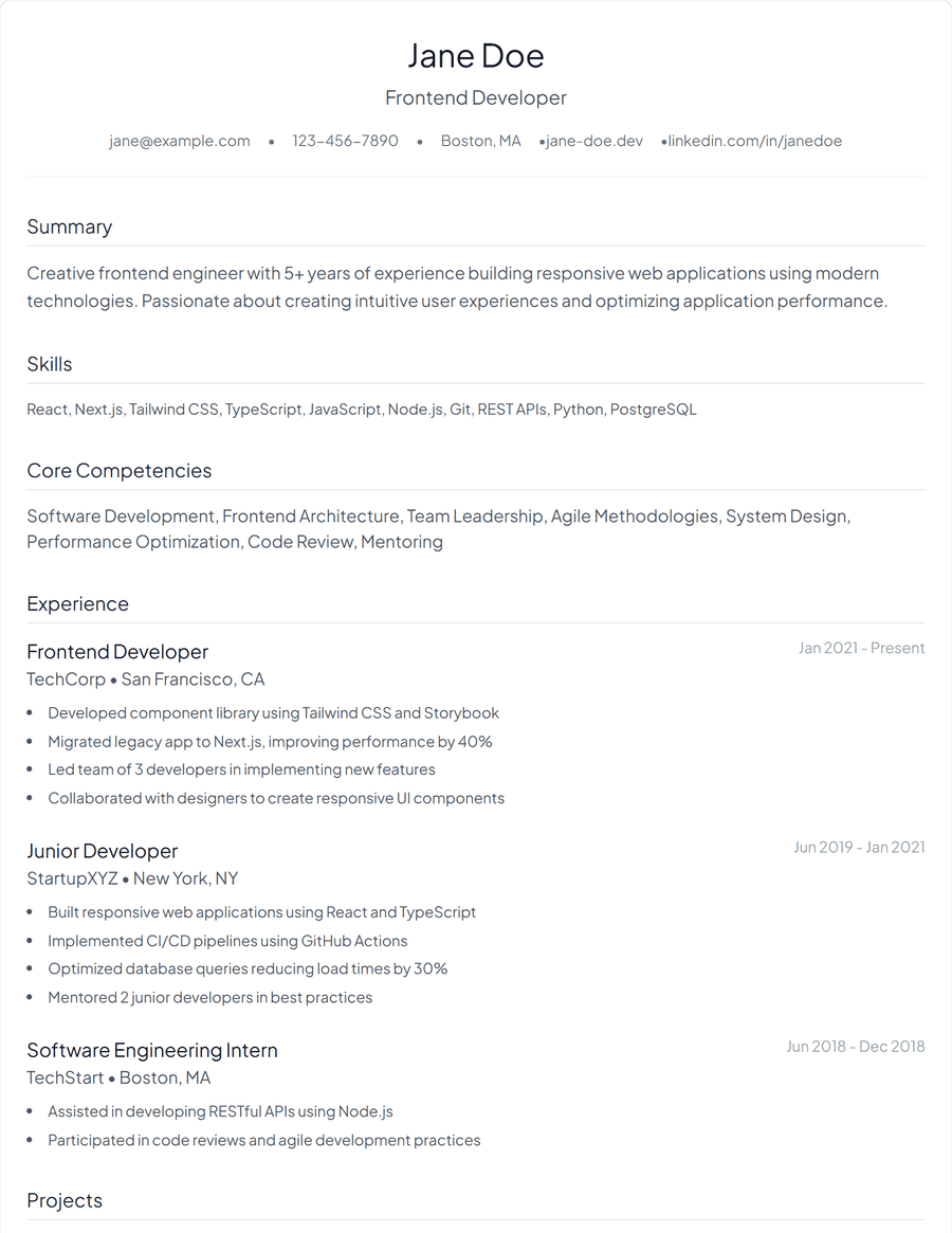
Minimal
Simple and focused design
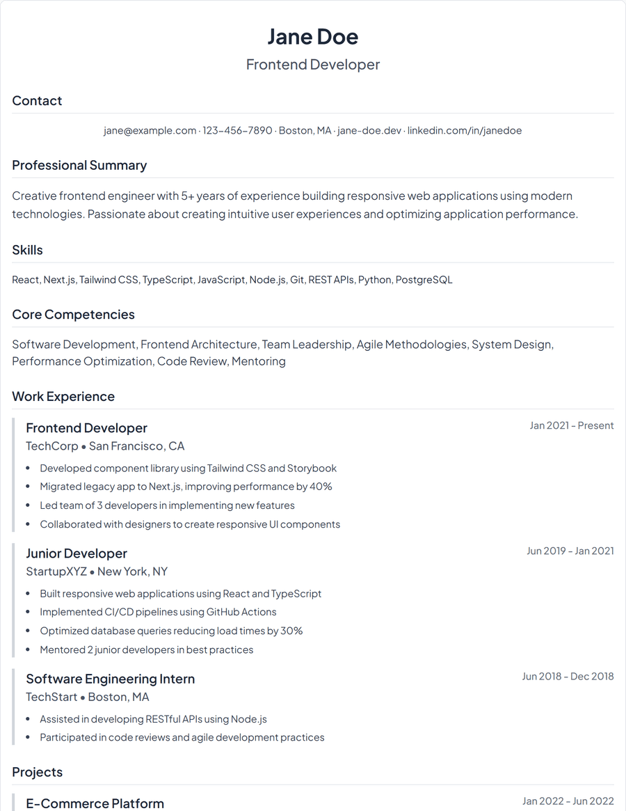
Classic Simple
One-column with centered header
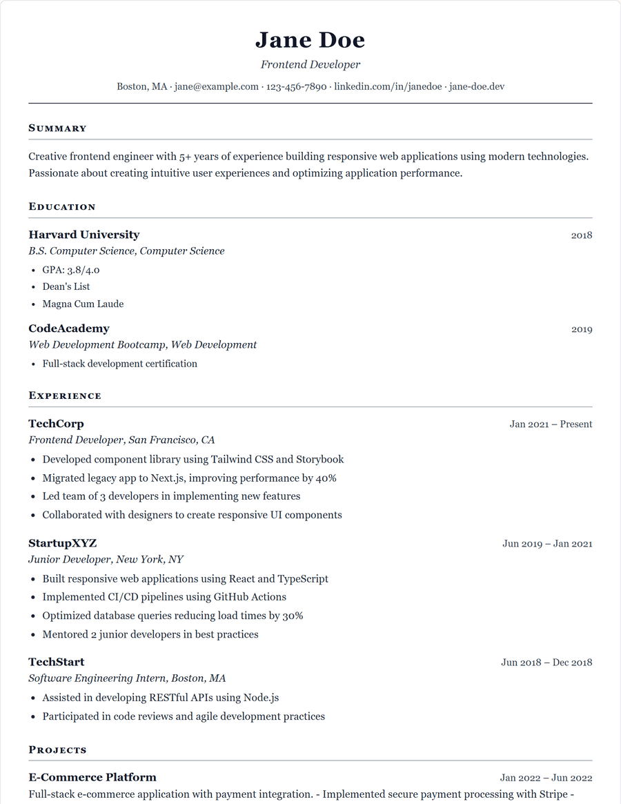
Ivy League
Serif and traditional, no accent colour
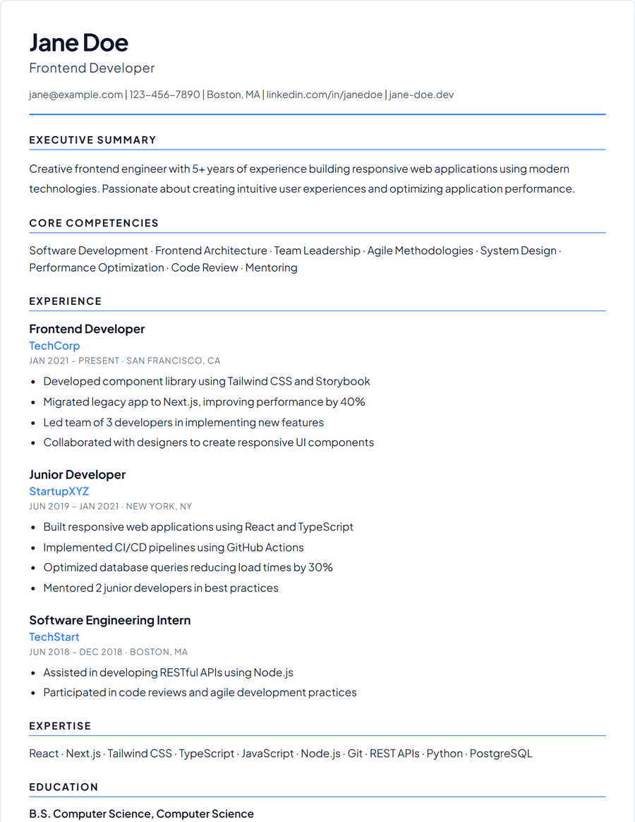
Executive
Senior-weighted, room for a longer summary
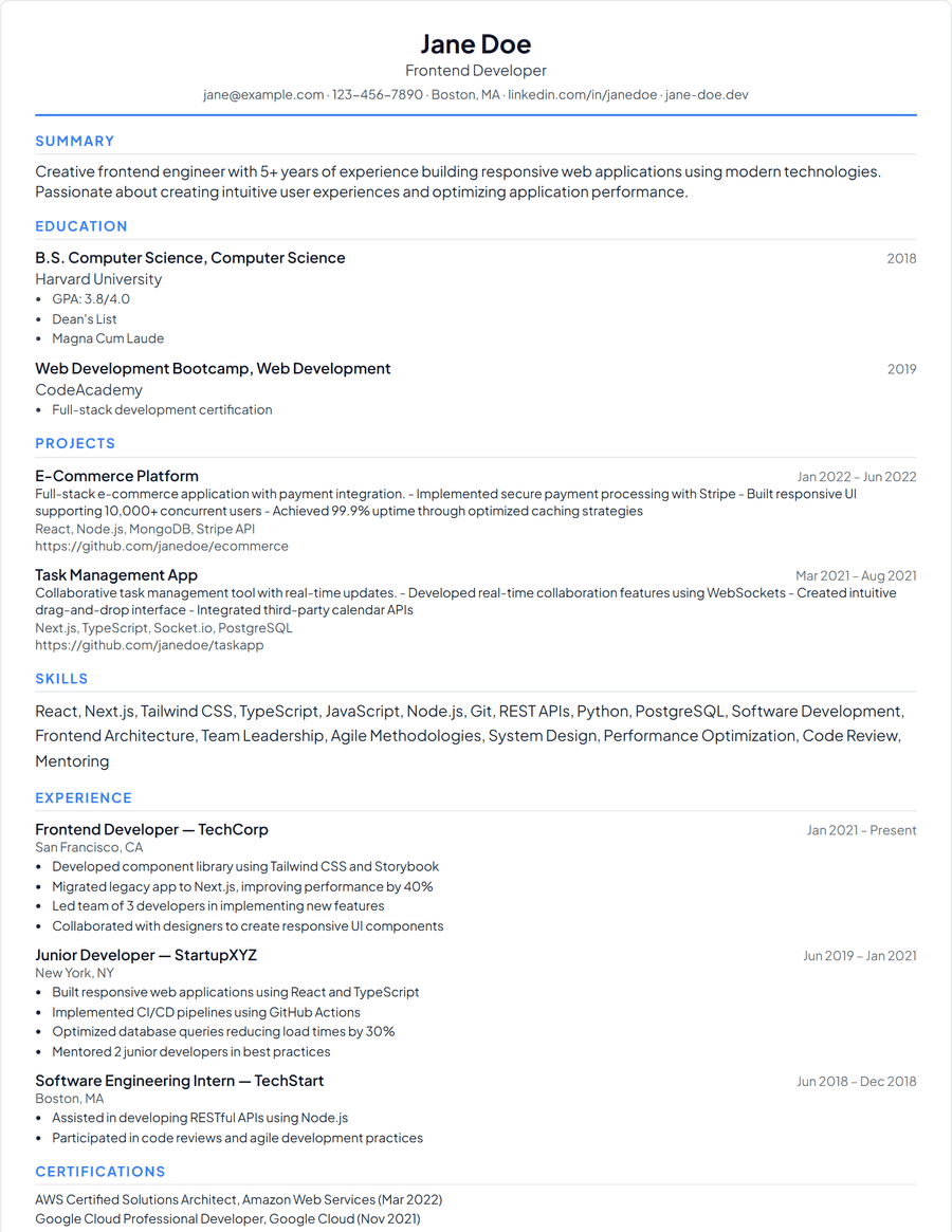
Entry Level
One page, education and projects first
ATS Templates
Optimized for applicant tracking systems. Maximum parse compatibility.
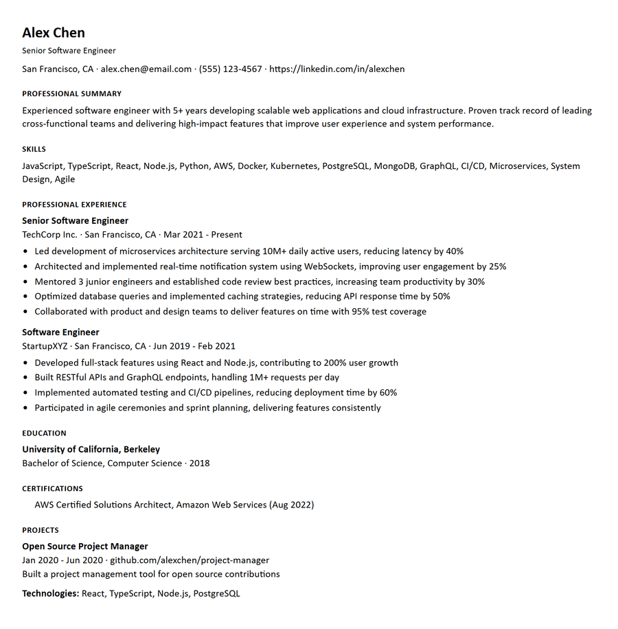
ATS • Standard (U.S.)
Standard (U.S.)
ATS • Compact (1 Page)
Compact (1 Page)
ATS • Senior (2 Page)
Senior (2 Page)
ATS • Academic CV
Academic CV
ATS • Federal (USAJOBS)
Federal (USAJOBS)
ATS • EU / UK
EU / UK
ATS • Entry Level / Early Career
Entry Level / Early Career
ATS • Tech / AI
Tech / AI
Which template should you use?
Every template here holds the same content. What changes is the order a reader meets it in and how much room each part gets, and that is worth choosing deliberately: the right shape puts your strongest evidence where someone skimming for six seconds will actually land on it.
Classic
A single column, a centered name, and ruled section headings. Nothing competes with the text, which is what makes it the safe default when you do not know how the resume will be read: a recruiter skimming a PDF, a hiring manager printing it, and a parser reading it top to bottom all get the same order. Choose it when your experience is the argument and you want nothing standing in front of it.
Modern
A two-column layout with contact details, skills and languages in a tinted sidebar, and experience across the wider column. The split earns its keep when your tooling matters as much as your job titles, which is usually true in engineering, data and design. It costs you some vertical space, so it suits people with a focused skill list rather than a long one.
Elegant
One column, with serif headings and more space between sections than Classic. The extra whitespace slows a reader down slightly, which helps when your bullets are dense or your summary is doing real work. A good fit for consulting, communications and other fields where the writing itself is part of what is being assessed.
Minimal
Wide margins, light weights, no rules between sections. The restraint only works if the content is already tight, because there is no visual structure to lean on: with six roles and thirty bullets it reads as an undifferentiated wall. Choose it for a one-page resume you have already edited hard.
Classic Simple
Classic with the header centered and the rules removed. It is the plainest of the recruiter-facing layouts, which makes it the one to pick when an employer asks for a resume in a specific format, or when you are pasting sections into an application form and want the on-screen version to match what you type.
Ivy League
Serif type throughout and no accent colour at all. The convention it follows is the academic and professional-services CV, where colour reads as decoration rather than signal. Choose it for law, academia, medicine, finance and anywhere a hiring committee rather than a single manager will read it.
Executive
Weighted toward the top of the page: a larger name block and room for a summary that runs several lines rather than one. That matters at senior level, where the first thing a reader needs is scope -- team size, budget, remit -- before any individual role makes sense. It is the wrong shape if you have fewer than about eight years of history to summarise.
Entry Level
Education and projects come before experience, and the whole thing is built to stay on one page. Ordering matters more than it looks: a recent graduate who leads with three months of part-time work buries the degree and the coursework that are actually the strongest evidence available. Choose it for a first or second job, an internship, or a career change into a field you have studied but not yet worked in.
What the ATS presets change
An applicant tracking system reads a resume as a stream of text, not as a page. Anything that carries meaning visually rather than textually -- a column, a table, an icon, a text box, a header or footer region -- is either dropped or reordered on the way in. The ATS presets remove all of it: one column, standard section headings, no graphics, and no layout that depends on where something sits on the page.
What the presets differ on is the small print that varies by market and by parser: page size and margins, type size, how dates are written, and whether a link appears as its label, its URL, or both. Standard US and Standard A4 are the two to start from. The rest exist because some employers and some parsers are stricter about one of those details than others.
A plain resume is not a worse resume. It is the same content with the presentation layer removed, which is exactly what the machine reading it wants. Keep a recruiter-facing template for the version a person will look at, and send the ATS version wherever an application form asks you to upload a file.